The price of cocoa has been on a tear as of late, but is the party finally over?
It just might be as evident by what the smart and dumb money have been doing.
The smart money has been dumping all the cocoa they can get their hands on. (BLUE LINE)
While the not to swift small speculators have been more than willing to buy. (RED LINE)
A quick look at the chart below will show you what happens when the smart and dumb money get into these positions. THE PRICE COLLAPSES!!
Now while it has been a near vertical rally I certainly am no fool and I would not sell short outright into such a strong rally. Maybe shorting as the price begins to decline would be a more prudent course. Take a Look and tell me what you think.
P.S. I almost have the commodity blog up and running, about 2 more weeks and it should be a go. This way I can have this blog for equities and the other for Futures.
As usual, have a great weekend!!
Saturday, March 31, 2007
The Potential Demise of the Price of CORN!!
I had talked last week about the craze over Ethanol and how this hype was driving corn prices to levels that simply were and continue to be unjustified.
This past week, the corn market seems to be realizing this fact and has started and intermediate, if not secular bear market.
The Blue line on the bottom of the above chart represents the smart money and the closer to the bottom that line is the more bearish is the smart money. As you can see, the smart money line has turned up and is trending higher now but it has a long way to go before the all clear signal is given. I think that Corn is just starting to crack.
Typically when you start to hear all the fluff about how prices are going higher because of demand and the sky is the limit it tends to be a great place to either exit your long positions and begin to establish a short line.
Yes it is true that this country is going to go on a big Ethanol push and that will be good for Farmers and I applaud this move. However, the real money to be made from this push towards growing more corn will rest with suppliers of Nitrogen Fertilizers and Pesticides. I realize neither of those terms are very sexy, but it is worth looking into.
Friday, March 30, 2007
The Picture is Pretty Clear on Equities
This chart speaks volumes about the health and condition of the equity markets.
The Red Line on the Bottom Represents the Small Speculators (Usually Wrong Crowd) and when that line is at or near the bottom end of the range as it is now it indicates very heavy selling by the not so savvy money. This is a very bullish signal and if you look back on this chart you can see what the S&P 500 has done each and every time the red line has gotten at or close to the lower end of the range.
Now, take a look at the Blue Line. This represents the Commercial Traders ( Smart Money)
As the not so swift money was selling like crazy, the smart money was snapping it up as fast as it came at them. Another very Bullish Indication.
Take into consideration how quickly this all happened and not even a 7% correction and you have a very healthy market and one that still has a bunch of upside left in it.
I will be devoting an entire Educational Module to the C.O.T. data and its very powerful.
Low for Correction May Have Occured Today
S&P 500 Intraday Stabilization - Should Rally From Here
Intra-Day Update Equity Markets Look Like They are Gasping for Breath Here!!!
Just thought I would send my first intraday update.
The S&P 500 DOES NOT look like it can hold these gains this morning.
It looks very weak in spite of the sharp rally.
We will see what the day gives us.
Have a Great Day!!!
The S&P 500 DOES NOT look like it can hold these gains this morning.
It looks very weak in spite of the sharp rally.
We will see what the day gives us.
Have a Great Day!!!
Thursday, March 29, 2007
Chinese Market May Still Be Ripe For Fall!!
DVSA - Some Potential Here!
Equity Market Comment
Market was able to stabilize here today after quite a volatile session.
Short Term Model continues to deteriorate, but at a lessening clip. Model sits at
Negative 7.5 and continues to call for lower prices.
I still look for the short term decline to move a bit lower as talked about before.
Looking for a low to come in on the Friday/Monday Time frame in the 1405-1400 level in the S&P 500.
USU put together a rally today back to short term resistance. I am still looking for the stock to break lower, but I will only use this pullback for additions to the position.
CHCI continues to move lower from the open and does not allow an entry point, but that is a blessing in disguise!!! No sense in giving the brokerage firms any additional commissions. : )
The Third Educational Module has been Posted, take a look.
Have a Great Evening
Wednesday, March 28, 2007
USEC Corp (USU) Pullback (Short Term or Intermediate)??
USEC Corporation looks like it wants to move lower. The only question at this point is if this is going to be a pullback before a final push higher or if this is a correction of the entire intermediate term move from 9 1/4.
I will let the stock tell me what it wants to do. I certainly cannot rule out another push towards 16 before it moves down sharply, it appears to me that the short term trend at least has shifted to down.
I have attached 2 charts that detail either scenario.
Good Luck!!
I will let the stock tell me what it wants to do. I certainly cannot rule out another push towards 16 before it moves down sharply, it appears to me that the short term trend at least has shifted to down.
I have attached 2 charts that detail either scenario.
Good Luck!!
Possible Short Squeeze on CHCI
It might be a little early, but from time to time anticipation can be a powerful tool, as long as losses are limited in case of error.
CHCI looks about poised to have a short covering rally. For those of you who do not know what short covering is, it is when those investors that are bearish on the stock and have sold short decide it is time to cover their trades and have to buy the stock back. This will drive the price of the stock sharply higher as the short covering feeds on itself.
There is a very large short position in CHCI, so there is some fuel for a possible 15% rally plus.
I have attached a chart to emphasize the position of the stock.
Equity Market Comment
Correction Continues with first major support at 1404 basis the S&P 500
Short Term Trend Model has Just Crossed Through its 50% Point, which indicates a possible half day or full day breather before the decline terminates.
I am thinking the lows should be reached this week or Monday, but I will let the market tell me for sure, IT IS ALWAYS RIGHT!!!
USEC Corp (USU) looks like it will move back to $15 before it should start its next leg to the upside. I will post a comment and chart for the stock.
Went long CHCI today for a potential upside POP!! I will post a chart for that as well.
Have A Great Day and Pass the Word about the Blog, I would really appreciate it!!
Module #3 Exponential Moving Averages
Module #1 and Module #2 covered the basics for Simple Moving Averages. This module is going to cover the same material, except we are going to use Exponential Moving Averages as opposed to Simple.
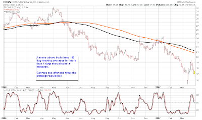
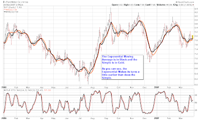
An Exponential Moving Average differs from the simple only by the way it is computed mathematically. Whereas, a Simple Moving Average gives each data point in its series an equal weighting, the exponential applies more weight to current data in the string as opposed to older data. In other words, if you have a 10 day Exp. Moving Average, the most current data is going to have more effect on the average than say the data point from 7 days ago. The basic theory behind this is simply that more recent price action has more relevance to the trend then does older data. To be honest with you, I am still a little up in the air about the validity of this concept. Therefore, the majority of my work utilizes Simple Moving Averages. Feel free to experiment with the two different types of moving averages and find the calculation you find most useful to your style of investing.
I am going to attach charts that will use the Exponential Moving Average for you to see just how they flow. I will use the same time frames and same stocks that I did with the module on Simple Moving Averages just so you can make the comparison.
Tuesday, March 27, 2007
Market Comment
Stock Market has entered a short term corrective phase with the S.T. Trend Model going to Negative 4.
First strong support comes in at 1405 on the S&P 500. I do anticipate the market to work lower short term as most trend models have turned over and this usually indicates lower prices over the short term.
It will not come as much of a shock to me if the market ends out March on a negative tone as I think April is going to be a very strong month.
Intermediate and Long Term models remain Bullish!!
Have a Good Day!!
Educational Module #2 Weekly and Monthly Simple Moving Averages
In module #1 we went over the use of simple moving averages on Daily prices for short, intermediate and long term.
This module is going to focus on the weekly and monthly time frames utilizing the simple moving average approach.
Because of the length of time the weekly averages cover, they can only be used on an intermediate and long term time frame. The monthly charts for Long Term only.
Many of the same ideas that were covered in Module #1 also pertain to the weekly and monthly time frames as well.
Take a look at the charts I have posted and read the comments on each chart, as each one will show you a different way to use the averages.
If you have any questions please feel free to post a comment or email me. Remember, there is no such thing as a dumb question.
The next module will follow the moving average concept as well as I will be covering Moving Average Crossovers as well as Price Envelope Bands made from the moving averages.
Monday, March 26, 2007
Educational Module #1 Simple Moving Averages
One of the most widespread used technical tools is that of the moving average.
The moving average is nothing more than taking the closing prices of a stock or index over a certain time period and certain time frame daily, weekly etc.
This helps to filter out much of the noise that is caused by either upside or downside volatility.
This cleaning up of the noise helps us to get a cleaner visual of the price action.
One of the difficulties with moving averages is what to set the time period at, in other words how many days, weeks or months do you want in the moving average.
First you have to determine what trend you want to look at, short, intermediate or long term.
Below you will see the different time frames along with what I use and what I have found work the best for daily charts. Once again, this does not mean they are either right or wrong, I have just found through extensive research that these work best for me.
**** Short Term - 6 and 11 day simple moving average
**** Intermediate Term - 39 day simple moving average
**** Intermediate/Long Term - 70 and 90 day simple moving average
**** Long Term - 125 and 180 simple moving average
I have attached charts showing all of these moving averages on stocks that I randomly picked from my archives. This way I was not mining stocks that worked best with certain moving averages. The charts are above for your inspection.
This completes the first module on daily simple moving averages.
I will be covering Weekly and Monthly time frames in the next module.
If you have any questions please feel free to drop me a line.
Equity Market Comment
Nice recovery today from the downside we saw early in the day after the home sales numbers came out. However I would not get to excited as the short term model went from Up-Weak to Neutral.
I do expect some type of pullback in here before moving higher once again.
Please see my weekend comment on the short, intermediate and long term trends.
I do expect some type of pullback in here before moving higher once again.
Please see my weekend comment on the short, intermediate and long term trends.
Stock to Watch - AGL
Here is an example of about the best consolidation pattern you can get.
Currently the stock is a bit overbought and brushing the upper Bollinger Band (The lines that follow the price above the highs and below the lows). With the overbought condition, the stock may move down one more time before making its move.
It is still a good one to have on the radar as once the price breaks above 28 1/4 on good volume it will be in a very strong position.
I am going to be posting some Educational Modules pretty soon as the first one is almost complete. I am also going to try and explain everything I see on the chart and how it works. Education is Power!!!
Subscribe to:
Posts (Atom)